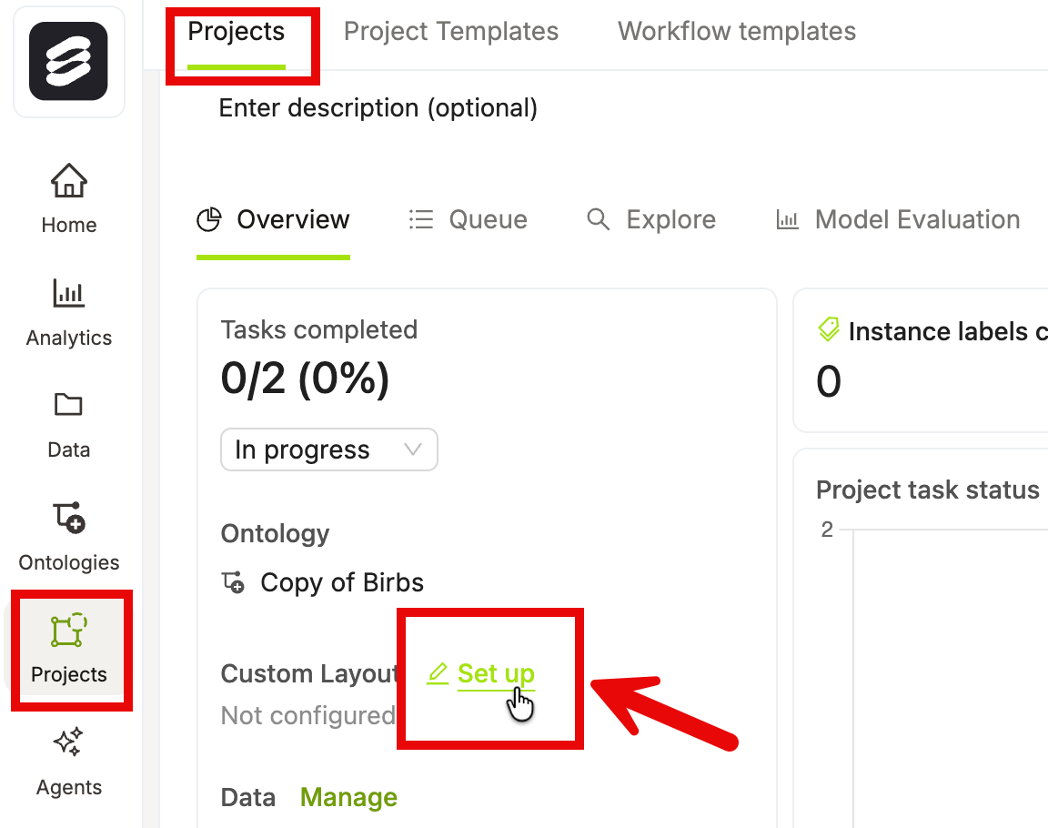
Creating Custom Layouts
The Task layout card on the Project Overview page shows the current layout status:
- Standard — your Project uses the default layout. No custom layout has been configured.
- Custom — your Project uses a custom layout you have configured.
- Open your Project and go to Overview.
- Click Set up (or hover over the Task layout card and click Edit if a custom layout already exists). The layout builder opens, showing the current layout and a palette of components on the left.
Previewing a Task Layout
You can preview the label editor experience directly from the Project Overview page without navigating away from it. The Task layout card includes a Preview button alongside the Edit/Set up button. Clicking Preview replaces the right-panel analytics content with an embedded label editor preview so you can see exactly how your task layout appears to annotators.The Preview button is disabled when the Project has no demo data and no linked datasets. Hover over the disabled button to see the tooltip: “Link data to this project to see a preview.” Link at least one dataset to the Project to enable the preview.
1
Open your Project Overview
Navigate to your Project and click Overview.
2
Click Preview on the Task layout card
Locate the Task layout card in the left panel. Click the Preview button next to the Edit/Set up button.Encord replaces the right-panel analytics content with an embedded label editor preview.
3
Toggle between demo data and real project data
If your Project has demo data configured, you can toggle between demo data and your real project data within the preview panel.
4
Close the preview
Click Close preview in the preview panel header to return to the standard analytics view.
Opening the preview is mutually exclusive with other Project Overview panels (Data, Ontology, and Layout modals). Only one panel can be active at a time.
Layout Structure
A layout is a tree of containers and items.- Containers hold other containers or items. They arrange their children either horizontally (side by side) or vertically (stacked).
- Items are the leaf nodes. Items render a specific piece of the UI, such as a media player, a classification field, or an object panel.
Edit Layout
- Add a component: Drag a component from the palette and drop it onto the canvas. Drop zones appear as you drag to indicate where the component can be placed. You can also click the Add item button inside any container to open a popover and select a component to add.
- Move a component: Drag an existing component to a new position within the canvas.
- Configure a component: Click a component to select it. Its configuration options appear in the panel on the right. Changes take effect immediately in the preview.
- Remove a component: Select the component and click the delete icon in the configuration panel, or use the context menu on the canvas.
- Edit as JSON: Toggle JSON editor to view and edit the layout as raw JSON. This is useful for copying layouts between Projects or making bulk changes. The editor validates the JSON structure on save.
Palette Components
- Stack: A vertical container. Children are arranged top to bottom. Use a Stack as the top-level wrapper for most layouts, or to group related fields below the media player.
- Columns: A horizontal container. Children are arranged left to right. Use Columns to place the media player and classification fields side by side.
-
Media: Renders the media player for the current task — image, video, audio, or document. Every layout should include exactly one Media component. You can configure:
- Controls —
fullshows all playback controls;minimalshows only essential controls. - Autoloop — automatically loops video or audio when playback reaches the end.
- Controls —
-
Field: Renders a single classification field from the Project’s Ontology. Custom layouts only support global classifications. Global classifications apply to the entire data unit. Frame-level classifications apply to individual frames and are not supported in custom layouts. When you add a Field component, you select which ontology classification it maps to. The display style depends on the field type:
You can also mark a field as read-only, which displays its value but prevents labelers from editing it.
-
Object: Renders an annotation panel for a single ontology object. The Objects section of the palette lists all objects defined in the Project’s Ontology that have not yet been placed in the layout. You can search objects by name. When you add an Object component, it maps to the corresponding ontology object and displays a shapes icon in the layout preview and configuration panel.
- Read only — check this option in the configuration panel to display the object panel without allowing annotators to make edits.
Each object can appear in the layout only once. Objects already placed in the layout are automatically removed from the palette to prevent duplicates. Archived objects never appear in the palette. - Multi-step: Renders a sequential step-by-step wizard. Each step contains its own set of fields. Use Multi-step for workflows where data must be captured in a specific order — for example, first annotating the front of a document, then the back.
Palette Sections
The palette organizes available components into clearly labeled sections. A search bar at the top filters results across all sections simultaneously.Global Classifications
The Global Classifications section lists all global classifications from the Project’s Ontology that have not yet been placed in the layout. Hover over the info icon next to the section heading to see a popover explaining that only global classifications are supported in Custom Layouts. Global classifications apply to the entire data unit. Global classifications that you have already added to the layout are removed from this section automatically. Archived classifications are hidden from the palette entirely.Unsupported
The Unsupported section lists any frame-level classifications defined in the Project’s Ontology. Frame-level classifications apply to individual frames rather than the entire data unit, and Custom Layouts do not support them. These entries appear greyed out and cannot be dragged into the layout. Each entry shows a Frame-level label. Hovering over an entry displays the tooltip: “Frame-level classifications are not supported in Custom Layouts.”Unsupported classifications appear in palette search results under the Unsupported section when their name matches the search query. Archived classifications remain hidden from both the Global Classifications and Unsupported sections.
Edit Ontology
An Edit ontology button is pinned to the bottom of the palette. Click it to open the Ontology editor without leaving the layout builder.The Edit ontology button is only visible to users with an Admin or Team Manager role on the Project.
Object Table
The object table displays all instances of an object class in a compact, spreadsheet-like view alongside the media. Each row represents one instance; each column represents an attribute defined on that object in the Ontology.Appearance
The object table uses a borderless, spreadsheet-like design. All field types — text, number, single-select, and multi-select — blend seamlessly into their cells without visible input borders or chrome. Column widths are fixed per field type:- Select and multi-select columns — 224 px wide.
- Text and number columns — 176 px wide.
- Instance column — labeled Instance; sizes to its content and displays a chip containing the object’s shape icon and a numeric index (for example,
1,2,3).
3 instances / 4 columns).
Responsive width
When the object table is placed next to media in a horizontal (Columns) layout, side panels maintain a stable width to prevent the object table from crushing the adjacent media pane:- Panels containing an object table use a fixed width of 40 rem.
- All other side panels use a fixed width of 28 rem.
- Both are capped at 50% of the row width.
Empty state
When no instances exist yet, the object table displays an empty state with a descriptive message and an Add instance button that includes its keyboard shortcut. The empty state always remains visible — it renders outside the scrollable table area so it is never clipped off-screen. The empty state message is context-aware:- When the draw tool is active, the message reads: “Draw on the canvas to create the first [object name].”
- Otherwise, the message reads: “Create the first instance of the [object name] object.”
Object table in the Layout Builder preview
The Layout Builder preview shows a live representation of the object table with sample rows. The preview accurately mirrors the runtime editor, including:- An Instance column header with instance chips showing the object’s shape icon and a numeric index.
- Attribute column headers showing the attribute name, an attribute type icon, and a required marker (
*) for any required attributes. - A labeled + Add button in the trailing column header for adding new columns (when the ontology is editable).
- A labeled + Add button with dashed ghost cells below it — when the ontology is editable and you have permission to add columns.
- A muted No columns label — when the ontology is not editable.
- Select a column: Click a column header to highlight the entire column. The selected column is also highlighted in the configuration panel on the right, where you can edit its settings.
- Rename a column inline: Click a column header to select it, then edit the column name directly in the header cell. Press
Enteror click away to confirm the new name. - Add a column: Click the + Add button in the header row. Select the column type from the dropdown — Text, Number, Single select, or Multi select. The new column is added immediately and selected in the configuration panel.
Add Item Popover
Every container in the layout includes an Add item button. Clicking it opens a popover with the following sections:- Containers — add a Stack or Columns container.
- Media — add the Media player (available only if no Media component is already present in the layout).
- Classifications — lists available global classifications from the Project’s Ontology.
- Objects — lists available ontology objects that have not yet been placed in the layout, searchable by name.
Global and Frame-Level Classifications
Custom layouts only support global classifications. Global classifications apply to the entire data unit, while frame-level classifications apply to individual frames. Frame-level classifications are visible in the palette under the Unsupported section so you can see which ontology fields exist but cannot be used in a custom layout. You cannot drag them into the canvas. When you remove a component containing a frame-based classification, Encord prompts you to confirm the action with the following warning:“Custom layouts only support global classifications. If you remove this, you cannot add it back to the layout.”Click Remove to confirm, or dismiss the dialog to keep the component in place.
Conditional Display
Conditional display lets you control when a field is shown to annotators. Instead of always rendering every field, you can configure rules so that a field only appears when other fields’ answers meet specific conditions. This keeps the annotation interface focused and reduces cognitive load for annotators. Conditional display is available for both classification fields and object items in the layout builder.Enable conditional display for a field
1
Select a field in the layout builder
Click a field or object item on the canvas. Its configuration panel opens on the right.
2
Locate the Conditional display section
Scroll to the Conditional display section at the bottom of the configuration panel.
3
Enable the toggle
Turn on the Conditional display toggle switch. The Display rule editor appears.
The toggle is disabled if no other referenceable fields exist in the layout, or if the field is currently marked as Required. Add at least one other field to the layout, or turn off Required, before enabling conditional display.
Build a display rule
When conditional display is enabled, the Display rule editor appears. A display rule consists of one or more conditions. Each condition specifies a source field, an operator, and a value. The field only renders when the conditions are met. Match mode At the top of the rule editor, select how multiple conditions are evaluated:- Match all — the field appears only when every condition is satisfied (AND logic).
- Match any — the field appears when at least one condition is satisfied (OR logic).
- A field selector — choose which other field’s answer to evaluate.
- An operator selector — choose the comparison to apply (options vary by field type).
- A value input — enter or select the value to compare against.
Advanced conditions (JSON-authored)
Conditional display and the Required setting
Canvas Badges
Field cards on the builder canvas automatically display inline badges that summarize each field’s visibility relationships. These badges give you an at-a-glance view of dependencies without opening each field’s configuration panel.- Hidden until … — appears on a field card when that field has an active display condition. The badge shows the same plain-language summary as the rule editor’s summary line. This badge is suppressed for required fields, since required fields always render regardless of conditions.
- N field(s) depend on this answer — appears on a field card when one or more other fields reference it in their display conditions. For example, if two fields are set to appear only when this field has a specific answer, the badge reads “2 fields depend on this answer”.
Object Table
The configurable editor includes an object table that lists every instance of an object type in the current task. The table provides controls for managing instances directly, without switching to the sidebar.Per-instance row actions
Hovering over an instance row reveals a … (kebab) button on the right side of the row. Click it to open the action menu for that instance. The menu contains the following actions, depending on the media type and instance state:- Track forwards — Runs SAM-based tracking forward from the current frame. Only available for SAM-trackable shapes on frame-based media (video and multi-frame assets).
- Track backwards — Runs SAM-based tracking backward from the current frame. Subject to the same conditions as Track forwards.
- Instantiate in frame — Adds the instance to the current frame. Only shown when the instance is not already present on the current frame.
- Delete — Removes the instance. Encord displays a confirmation dialog before deleting.
Row actions are hidden when the editor is in view-only mode or when the table is in a disabled state.
Frame range pills
For video and multi-frame assets, each instance row displays its frame ranges as pills beneath the instance name. These pills are for reference only — clicking a pill does not navigate to that frame.Frame range pills display zero-based frame indices, which may differ from the frame numbers shown in the scrubber.
Select tiles (Data Groups)
For Data Group assets, a tile picker dropdown appears in the object table header row. Use it to filter the instance list to a specific tile or view all tiles at once.- Selecting a tile filters the table to show only instances belonging to that tile, and sets it as the active tile in the editor.
- Selecting All tiles shows instances across all tiles and clears the active tile filter.
Layout Validation
Before you can save a custom layout, Encord validates the configuration and surfaces any errors that would result in an incomplete or broken annotation experience. Encord checks for the following issues:- Empty containers — A Stack or Columns container that contains no children. Add at least one component to the container, or remove it from the layout.
- Empty Multi-step steps — A step inside a Multi-step component that contains no fields. Add at least one field to the step, or remove the step.
- Incomplete Slider configuration — A Slider field with no minimum or maximum value set. Both values are required before saving.
- Missing required classifications — A classification marked as required in the Project ontology that has not been added to the layout. Every required classification must appear somewhere in the layout — either directly or inside a Multi-step step — before you can save.
- Missing required objects — An object with one or more required (non-archived) attributes that has not been added to the layout. Every such object must appear somewhere in the layout before you can save. This check mirrors the existing behavior for required classifications.
Validation errors appear in the header of the layout builder. Click an error message to highlight the affected component in the canvas. Errors related to missing required classifications or missing required objects do not highlight a specific component, since the field or object has not yet been placed in the layout.
- To update your Project’s Ontology without leaving the layout builder, click the Edit ontology button at the bottom of the palette.
- The Edit ontology button is only visible to users with an Admin or Team Manager role on the Project.